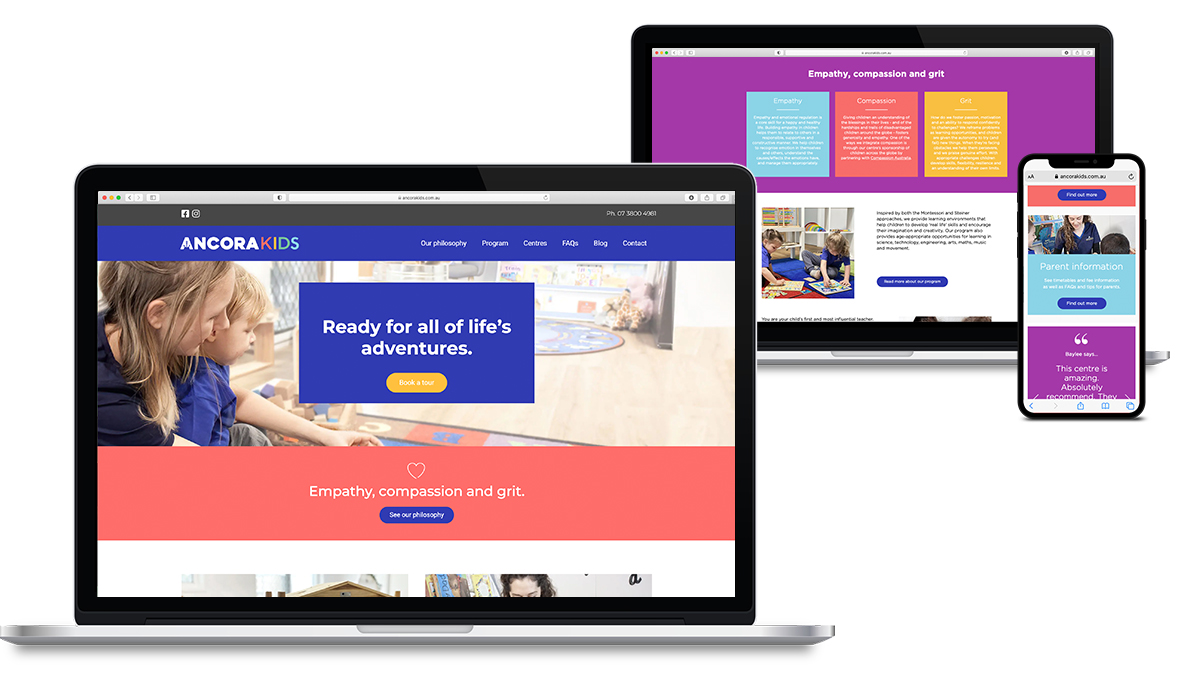
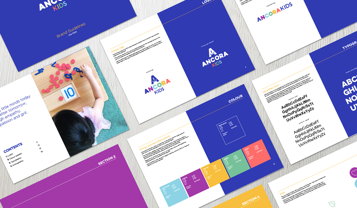
THE PROBLEM:
Ancora Kids had an out-dated logo and no consistent branding. With plans to expand their childcare centres, it was time for a redesign. The new brand needed to reflect their playful and caring environment while also feeling professional and reflecting their innovative philosophy of equipping kids with empathy, compassion and grit.
THE SOLUTION:
The new logo retains the ‘anchor’ element from the previous branding for continuity and name recognition. However the new branding feels modern, innovative and stands out within the industry. The new bold, bright colour pallet is both playful and professional. Overall, the new branding reflects their confidence in delivering a unique program for the kids.