Maybe you’re working with a graphic designer for the first time, or perhaps you’re thinking about learning some design skills yourself. Either way, I’m sure you’d like to sound (and feel) like less of a design noob, but don’t know where to start. Welcome to my ‘Design 101’ blog series, from someone who’s been in the industry for over 10 years.
In this post we’re discussing the difference between printing and digital.
A common mistake made by regular-non-designer-people, is to think you can just download something off the internet and send it to print. There’s two things to consider here: colour space and resolution.
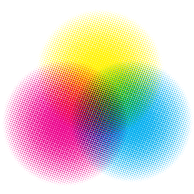
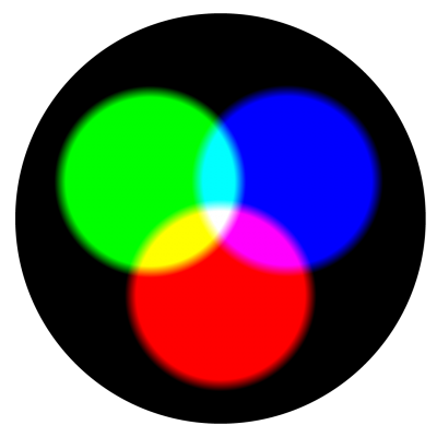
It refers to how the colour information is stored. The two most common ones are CMYK which is used for printing, and RGB which is used for digital.
CMYK stands for Cyan, Magenta, Yellow and Black (‘Key’). They are the 4 colour pigments required to make printed colour. You may remember mixing paints as a kid, which is based on the same idea. Most printers have a cartridge for each ink colour. The ink is sprayed onto the paper in tiny dots to create the correct mix and can create millions of different shades of colours.

Each colour can be represented by a specific percentage of each ink. For example ‘C50 M0 Y50 K0’ would be 50% cyan, and 50% yellow, which makes a green colour. If you added 20% black (C50 M0 Y50 K20) it would be a darker green. CMYK values are based on the assumption that your background paper colour is white (if it’s not, you’d need a spot ink which is pre-mixed).
RGB stands for Red, Green and Blue. They are the three colours required to make colour in the light spectrum. The idea of mixing light probably isn’t something you come across much, but think about it like this… Imagine you have three torches pointing at the same spot on a white wall, with red, green or blue cellophane over each torch. You can set the brightness of each torch from 0 (no light) to 255 (super bright). For example, if all the torches are set to full brightness, you get white light. If you then turn off the green torch (R255 G0 B255) you get pink light.

RBG has a wider range of colours than CMYK that can be displayed (pro tip: this is called a gamut), so on screen, CMYK colours tend to look a bit duller than RGB. Converting from one colour space to another doesn’t always produce good results, so it’s best to design for the colour space that it’s intended for. So now that it sounds slightly less like gibberish, what does this all mean? Images on the web will generally be in RGB, and not suitable for printing without converting first, and visa-versa.
Resolution is the picture quality of an image or graphic. You’ve probably heard screen sizes described in pixels (particularly when someone is trying to sell you a TV). But what actually is a pixel? I’m glad you asked.
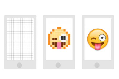
What is a pixel? Every screen is divided into a vertical and horizontal grid, creating tiny squares called pixels. Each pixel can be any colour, and by creating patterns out of these coloured squares, we can create everything you see on a screen, including the images and the text you’re reading right now (hi pixels!).
So, let’s say I have an icon that is 10 pixels high and 10 pixels wide (10px x 10px). That looks great if it’s taking up 10×10 pixels on your screen. It would also look fine if you zoomed out, so it was taking up 5×5 pixels on your screen. Where the problems start is when you zoom in, so the icon is now displaying at 20×20 pixels. There’s only 100 pixels (10×10) of information trying to display on 400 pixels (20×20) of screen. That’s when you start seeing jagged, blurry images.

Print v digital resolution
Raster v vector graphics
Congratulations, you now know what a pixel is, let’s hope it’s a question in the pub quiz this week. These kinds of images (that are based on pixel information) are called ‘raster’ or ‘bitmap’ images. However, as you may have heard, computers are pretty clever. And there’s another way they can store information, other than through pixel values.
The alternative is ‘vector’ graphics. These are basically a set of points, lines, shapes and fills which your computer can then display on your (pixel-displayed) screen. So, let’s say you have a vector file which tells your computer: draw a green circle with a 5cm diameter. You could repeatedly zoom into that circle and it would always look crisp. It’s the magical world of mathematics, so theoretically you could zoom infinitely (if you’re into that sort of thing).

Fonts are made up of vector shapes (AKA letters) and that is why you can make your font size bigger without it looking blurry. Most logos will be vector files which means they can be printed at truck or airplane size and still look schmick.
When designing anything, it’s best to design for the intended use. That’s why it’s important to know before-hand whether it’ll need to be CMYK or RGB, and print resolution, digital resolution or vector. Clients, now you know why us designers are always asking so many questions!
Milk & Whisky © 2022