THE PROBLEM:
The Browne Firm is a legal firm based in New York which prides itself on being innovative and approachable. In an industry known to be complicated and old-fashioned, they aim to make legal advice as easy and accessible as possible. The brief was to re-brand the company to reflect these values, while maintaining a visual link to the legal industry.
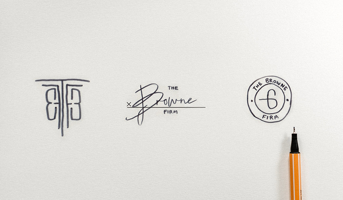
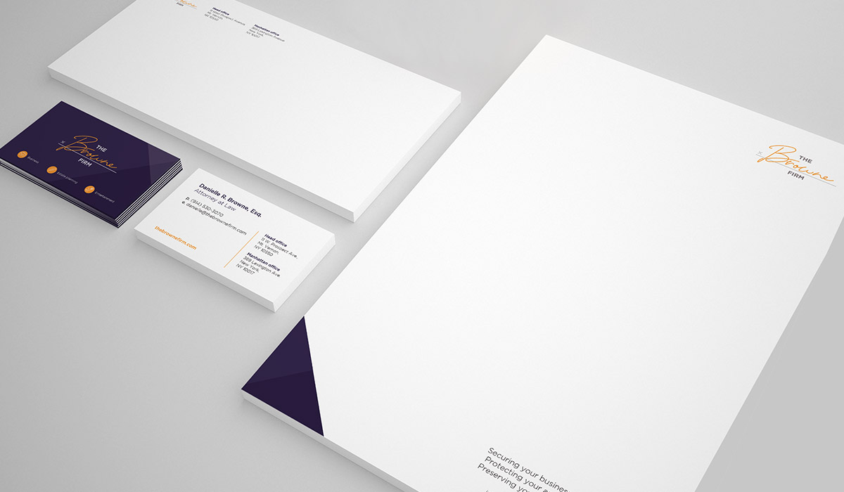
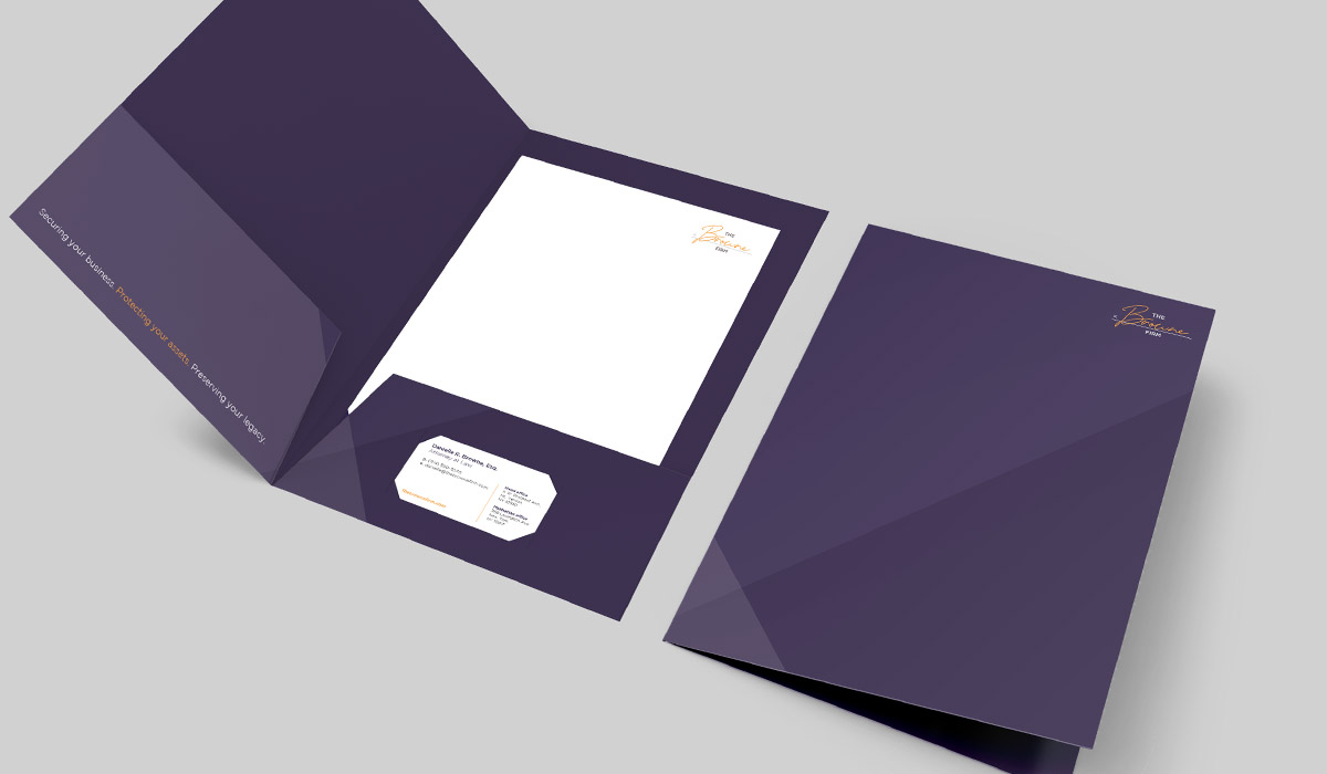
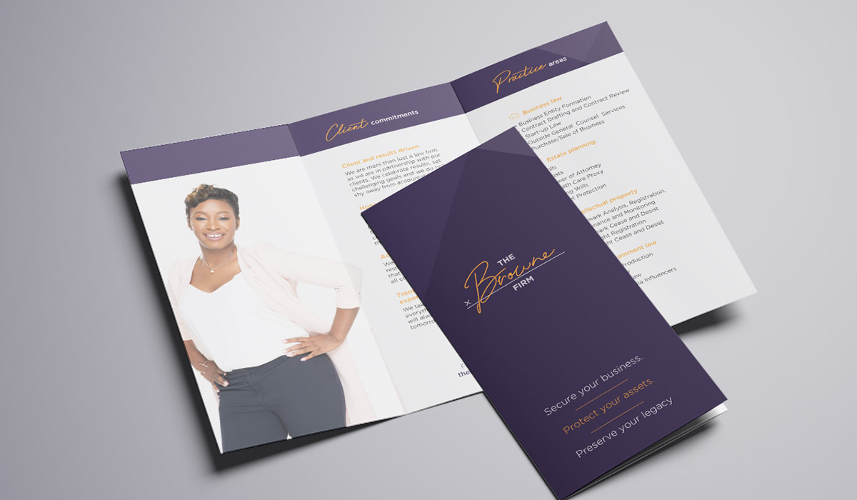
THE SOLUTION:
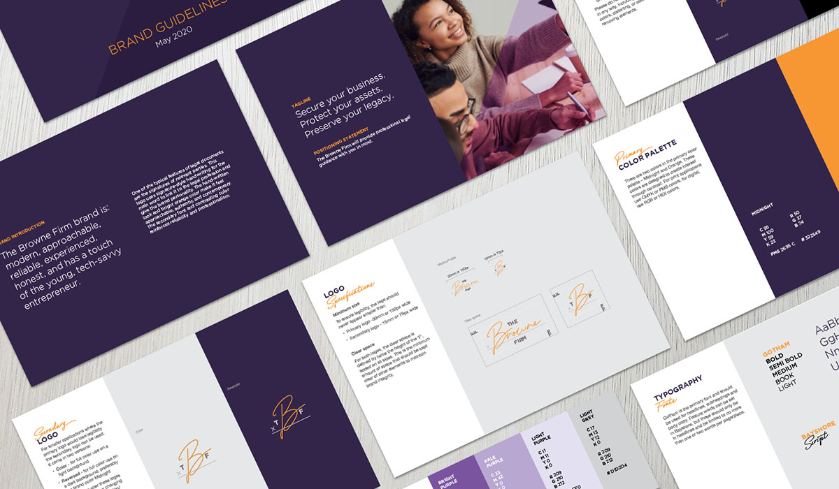
One thing almost all legal documents have in common are signatures. This logo uses signature-style handwriting for the main word to link it to the legal profession and give the brand personality. The hand-written look and bright orange colour make it feel approachable, authentic and contemporary. The dark purple colour pallet lends gravity and professionalism to the brand.