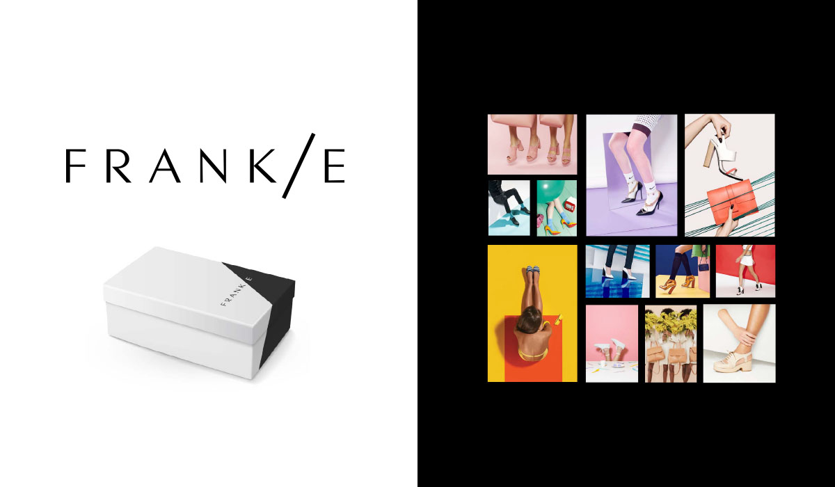
THE PROBLEM:
Frank/e had an existing logo but no branding to support it. The shoes were edgy, fashionable and used unusual materials. The new branding needed to be modern, bold and angular to fit with the existing materials. And it needed to appeal to a young, fashionable audience.
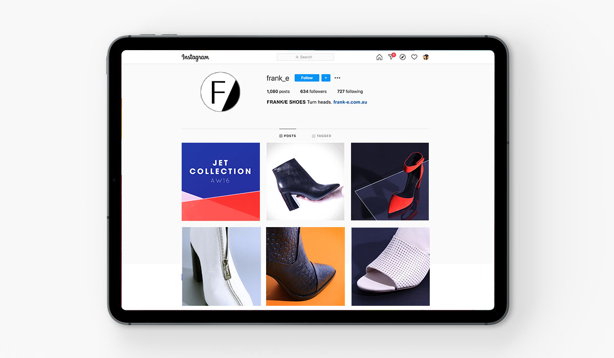
THE SOLUTION:
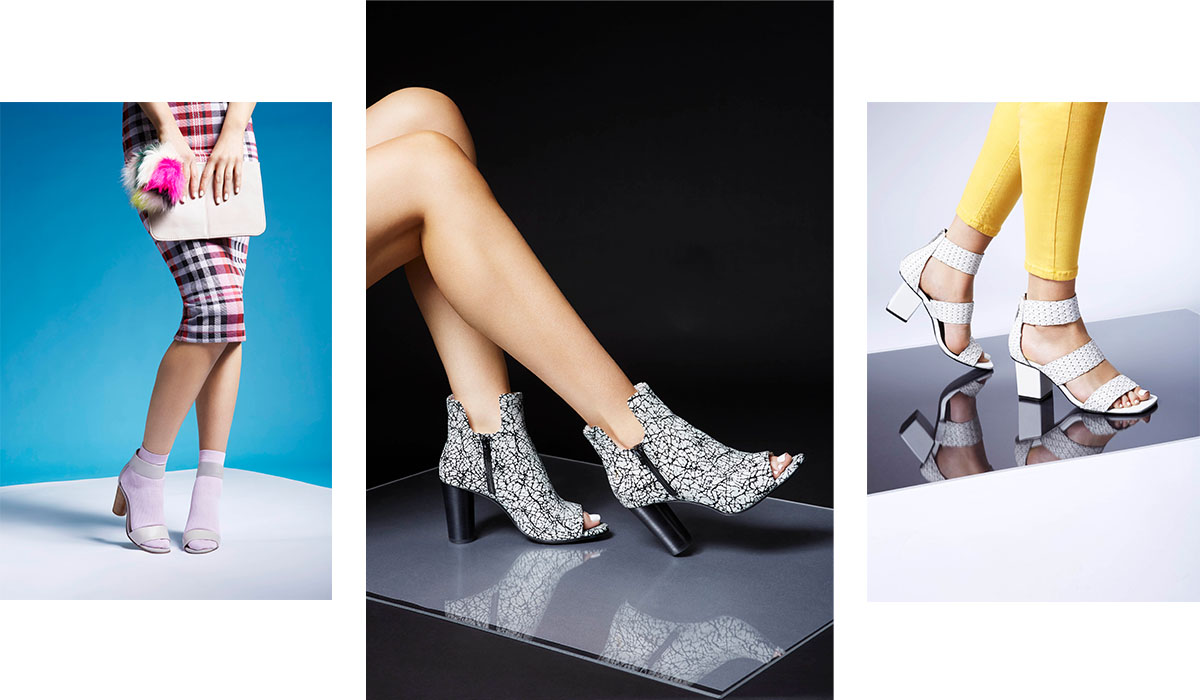
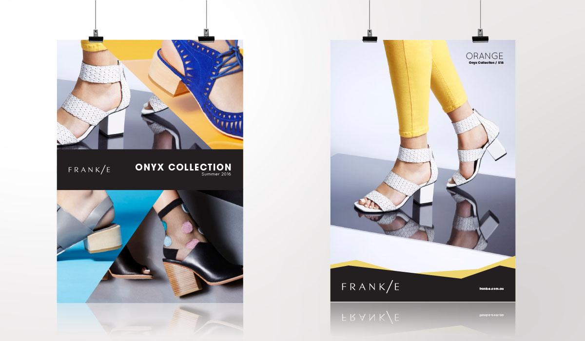
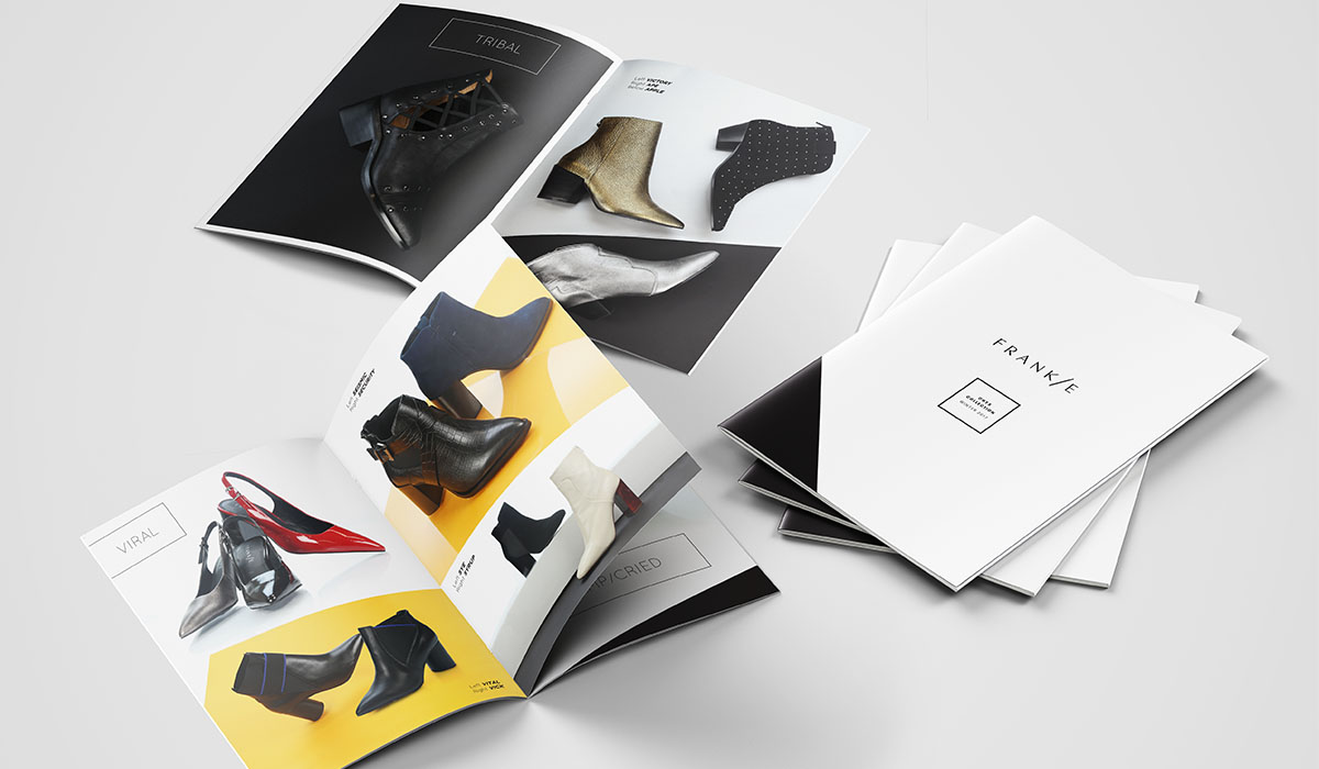
As a fashion product, the brand would rely heavily on product photography. A visual style was developed based on monochrome and pop colours, interesting textures and finishes, and solid angular lines. The art direction for photo shoots was to use bodies but not faces, which was economical, flexible and directs focus to the shoes. Combined with brand fonts, a bold colour palette and a confident tone of voice, the brand was now ready to launch off the runway.