Design | Branding | Creativity

MEIR

Meir THE PROBLEM:The tapware made by Meir is of the highest quality, but in an industry awash with cheaper options, how do you convince customers to pay a bit more for a better product? THE SOLUTION:Building messaging around Meir’s impeccable track record of low numbers of faults/returns, and inspiring customers with aspirational photography that showcases… Continue reading MEIR

GET HAPPY

Get Happy THE PROBLEM:No one enjoys buying energy, and there’s very little difference between energy companies. It’s a boring industry with most advertising centred around price or special offers. To stand out, Momentum Energy needed to do something different that would help them be remembered.   THE SOLUTION:A comprehensive brand campaign based on making the… Continue reading GET HAPPY

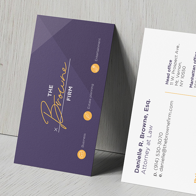
THE BROWNE FIRM

The Browne Firm THE PROBLEM:The Browne Firm is a legal firm based in New York which prides itself on being innovative and approachable. In an industry known to be complicated and old-fashioned, they aim to make legal advice as easy and accessible as possible. The brief was to re-brand the company to reflect these values,… Continue reading THE BROWNE FIRM

EOS FOOTWEAR

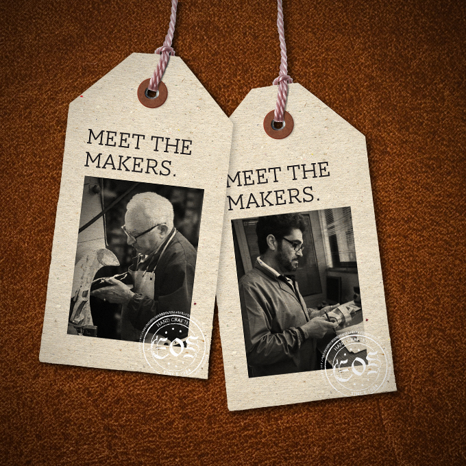
EOS Footwear THE PROBLEM:The EOS brand had always been founded on craftsmanship and quality. Saying their shoes were made in a traditional Portuguese leather-working town had been their strongest way of communicating this. However, they now wanted to be able to diversify their production locations without undermining the brand values.   THE SOLUTION:A campaign based… Continue reading EOS FOOTWEAR

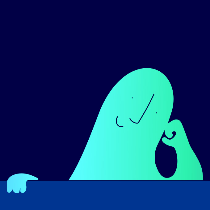
MOMENTUM ENERGY

Momentum Energy THE PROBLEM:Momentum Energy’s website needed a refresh – they wanted it to look simple, easy, professional and have a slightly quirky human touch. Stock photography couldn’t be more boring, so we decided to develop illustrations to create interest in new designs and give the website the human touch.   THE SOLUTION: Two new… Continue reading MOMENTUM ENERGY

FRANK/E

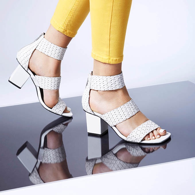
FRANK/E THE PROBLEM:Frank/e had an existing logo but no branding to support it. The shoes were edgy, fashionable and used unusual materials. The new branding needed to be modern, bold and angular to fit with the existing materials. And it needed to appeal to a young, fashionable audience.   THE SOLUTION:As a fashion product, the… Continue reading FRANK/E

BABY SLEEP SCHOOL

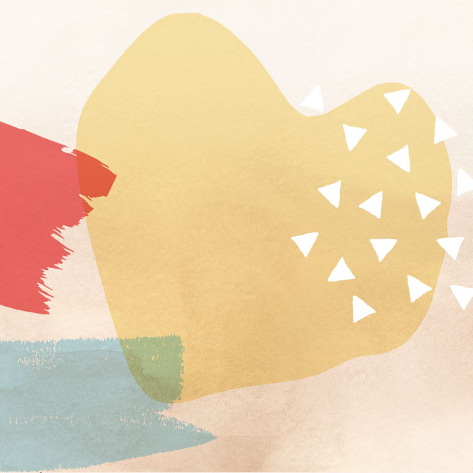
Baby Sleep School THE PROBLEM:Baby Sleep School had an existing logo and branding, but as they expanded into new areas like products and an app, it was time for a refresh. It needed to appeal to a female audience and feel bright and contemporary.   THE SOLUTION:A suite of coloured splashes and brush patterns were added to… Continue reading BABY SLEEP SCHOOL

ILLUSTRATIONS

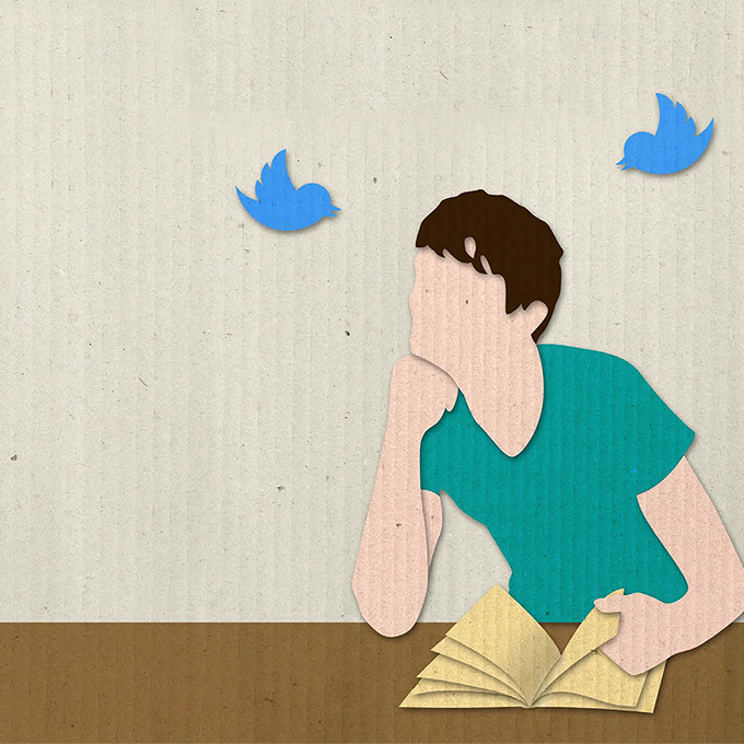
Various illustration OFF THE SHELF:Off The Shelf was a digital magazine published by Penguin Random House for teachers. This illustration was for an article about technology and shorter attention spans in readers. This is a digital illustration designed to mimic the textures of collage. TEXT PUBLISHING:Each month Text Publishing would run press ads highlighting some… Continue reading ILLUSTRATIONS