Design | Branding | Creativity

MEIR

Meir THE PROBLEM:The tapware made by Meir is of the highest quality, but in an industry awash with cheaper options, how do you convince customers to pay a bit more for a better product? THE SOLUTION:Building messaging around Meir’s impeccable track record of low numbers of faults/returns, and inspiring customers with aspirational photography that showcases… Continue reading MEIR
WITH MOVEMENT

With Movement THE PROBLEM: In an industry full of people struggling to reach their goals, With Movement wanted to do fitness differently. With tailored classes, group motivation, and the flexibility to fit into real lives, their online offering was all about boosting fitness without judgement.   THE SOLUTION:A dynamic logo and branding was developed based… Continue reading WITH MOVEMENT

NORD

Nord Wine Bar THE PROBLEM: Opening a new wine bar in an up-and-coming area of Melbourne, the branding needed to attract foodies and wine-lovers (it is Melbourne after all) without alienating the local comfy-jean-wearing crowd.   THE SOLUTION:A simple typographic logo gives the branding sophistication without feeling wanky. The small nod to olives creates a… Continue reading NORD

MILK AND WHISKY

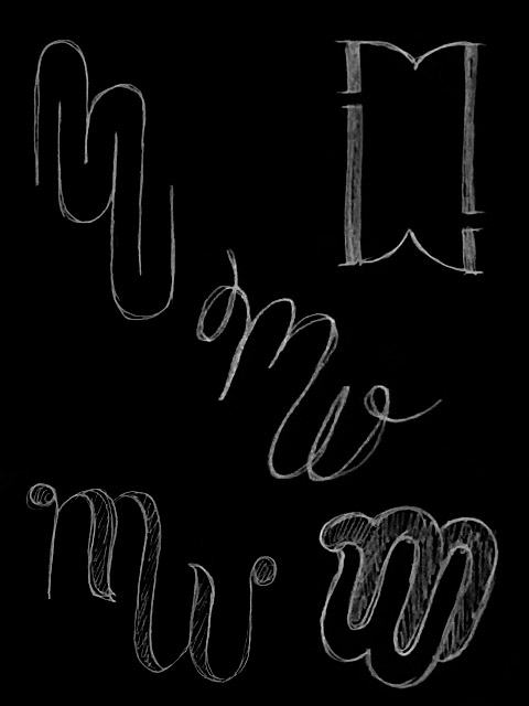
Milk & Whisky THE PROBLEM: When it came time to rebrand, ‘Milk & Whisky’ was chosen as a name to represent the mixing of the rational with the intuitive, but now it needed branding to match. To demonstrate branding expertise, the logo had to be confident – something both edgy and classic.   THE SOLUTION:The… Continue reading MILK AND WHISKY

PINK TULIP

Pink Tulip THE PROBLEM: Moving to a new shop meant this florist was ready for new branding too. It needed to appeal to high-end customers buying flowers for big events and weddings, without excluding the everyday bunch-buyers.   THE SOLUTION:Taking inspiration from the Art Nouveau period was a perfect fit, feeling both on-trend and timeless.… Continue reading PINK TULIP

Message vs style in logo design

Knowing the difference between a logo’s message and style means you can give effective feedback – and end up with a better logo.

AUSTRALIS

Australis Yachting THE PROBLEM:Australis has specialised services tailored to sun-seekers yachting in the Asia-Pacific region. The branding needed the professionalism to be trusted with visa applications – and the personality to recommend the best seafood restaurant.    THE SOLUTION:The custom logotype takes inspiration from the bold sweeping curves of a yacht’s bow – creating a… Continue reading AUSTRALIS

KIP & BOO

Kip & Boo THE PROBLEM: Kip & Boo was a new business about to launch a new type of sleepwear – comfortable enough to sleep in, stylish enough to leave the house. The brand philosophy is based around self-care so the branding needed to feel like a holiday.   THE SOLUTION:The feminine typography paired with a… Continue reading KIP & BOO

GET HAPPY

Get Happy THE PROBLEM:No one enjoys buying energy, and there’s very little difference between energy companies. It’s a boring industry with most advertising centred around price or special offers. To stand out, Momentum Energy needed to do something different that would help them be remembered.   THE SOLUTION:A comprehensive brand campaign based on making the… Continue reading GET HAPPY

Accessible pdf tips

It’s not hard to make pdfs created in InDesign accessible for people who use screen readers. Just follow these tips to get started.

LOGOS

Logos Some logos never never find a home in a full branding suite, but they’re always welcome here.  Le Oloa – Accessories Hello Today – Jewish stationery Vintage Garage – Fashion Super Yacht Imports – Yachting Parenting Austistic Kids – Podcast My Baby & I – Medical Hitch – Commerce expansion Similar projects The Browne… Continue reading LOGOS

How to write a great brief

Great designs usually come from great briefs. But what makes a great brief? Answer these five questions and your designer will love you.

Design software

More Design 101, this time covering the three main design software: Illustrator, Photoshop and InDesign. What are they used for? I’m glad you asked…

Colour space and resolution

In this Design 101 post, we cover off the difference between CMYK and RGB colour spaces, what is a pixel and how to make things look crisp

HYDRO GROUP

Hydro Group THE PROBLEM: Hydro Tasmania Group had three external-facing brands but needed a way to unify staff and simplify internal communications across the group. The three brands – Hydro Tasmania, Entura and Momentum Energy – had never been designed to work together, so the challenge was to create an identity that was harmonious and… Continue reading HYDRO GROUP

THE BROWNE FIRM

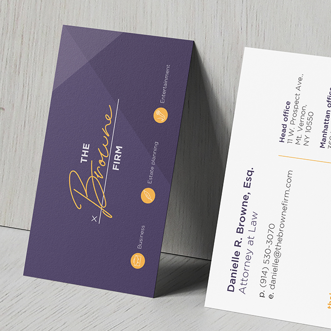
The Browne Firm THE PROBLEM:The Browne Firm is a legal firm based in New York which prides itself on being innovative and approachable. In an industry known to be complicated and old-fashioned, they aim to make legal advice as easy and accessible as possible. The brief was to re-brand the company to reflect these values,… Continue reading THE BROWNE FIRM

ANCORA KIDS

Ancora Kids THE PROBLEM: Ancora Kids had an out-dated logo and no consistent branding. With plans to expand their childcare centres, it was time for a redesign. The new brand needed to reflect their playful and caring environment while also feeling professional and reflecting their innovative philosophy of equipping kids with empathy, compassion and grit.  … Continue reading ANCORA KIDS

EOS FOOTWEAR

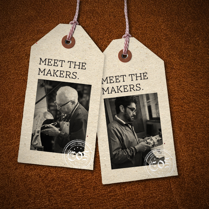
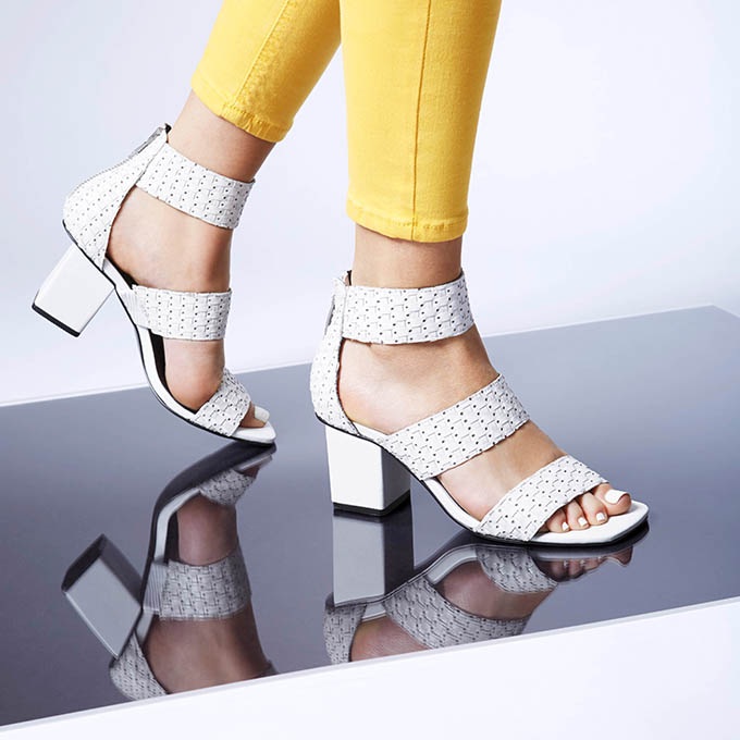
EOS Footwear THE PROBLEM:The EOS brand had always been founded on craftsmanship and quality. Saying their shoes were made in a traditional Portuguese leather-working town had been their strongest way of communicating this. However, they now wanted to be able to diversify their production locations without undermining the brand values.   THE SOLUTION:A campaign based… Continue reading EOS FOOTWEAR

MOMENTUM ENERGY

Momentum Energy THE PROBLEM:Momentum Energy’s website needed a refresh – they wanted it to look simple, easy, professional and have a slightly quirky human touch. Stock photography couldn’t be more boring, so we decided to develop illustrations to create interest in new designs and give the website the human touch.   THE SOLUTION: Two new… Continue reading MOMENTUM ENERGY

FRANK/E

FRANK/E THE PROBLEM:Frank/e had an existing logo but no branding to support it. The shoes were edgy, fashionable and used unusual materials. The new branding needed to be modern, bold and angular to fit with the existing materials. And it needed to appeal to a young, fashionable audience.   THE SOLUTION:As a fashion product, the… Continue reading FRANK/E

BABY SLEEP SCHOOL

Baby Sleep School THE PROBLEM:Baby Sleep School had an existing logo and branding, but as they expanded into new areas like products and an app, it was time for a refresh. It needed to appeal to a female audience and feel bright and contemporary.   THE SOLUTION:A suite of coloured splashes and brush patterns were added to… Continue reading BABY SLEEP SCHOOL

ARTS CENTRE MELBOURNE

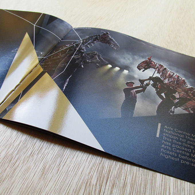
Arts Centre Melbourne THE PROBLEM:Arts Centre Melbourne (ACM) needed to secure more corporate sponsorships to continue providing a world-class arts program. The brochures needed to feel  premium and aspirational for a business audience, and use existing photography of performances, the venue and their collection. THE SOLUTION:A new style was created using the iconic spire as a flexible… Continue reading ARTS CENTRE MELBOURNE

ILLUSTRATIONS

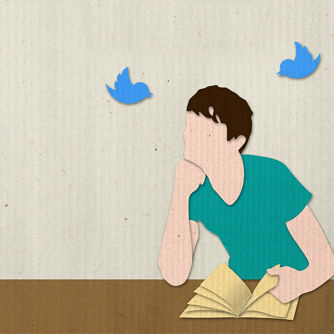
Various illustration OFF THE SHELF:Off The Shelf was a digital magazine published by Penguin Random House for teachers. This illustration was for an article about technology and shorter attention spans in readers. This is a digital illustration designed to mimic the textures of collage. TEXT PUBLISHING:Each month Text Publishing would run press ads highlighting some… Continue reading ILLUSTRATIONS

VARIOUS LOGOS

Various logos MANIFESTO OF LIGHT:Manifesto of Light, a natural-based perfumery needed a logo that felt classic, sophisticated and sexy. Using traditional monograms as inspiration, this logo looks perfect engraved on a perfume bottle. THE POWDER ROOM:The Powder Room was an identity for an activation booth run by L’Oreal at the Melbourne Fashion Festival. It uses… Continue reading VARIOUS LOGOS